Ever started signing up for an online event, only to feel like you’re applying for a mortgage?
Name and email—sure, that’s fine. But then they ask for your company’s revenue, your grandmother’s maiden name, and what you had for breakfast. Annoying, right?
A confusing registration form is the fastest way to lose attendees. The good news? You don’t have to make that mistake.
In this blog, we’ll break down exactly what makes a great online event registration form template—one that gets people signed up fast without frustration.
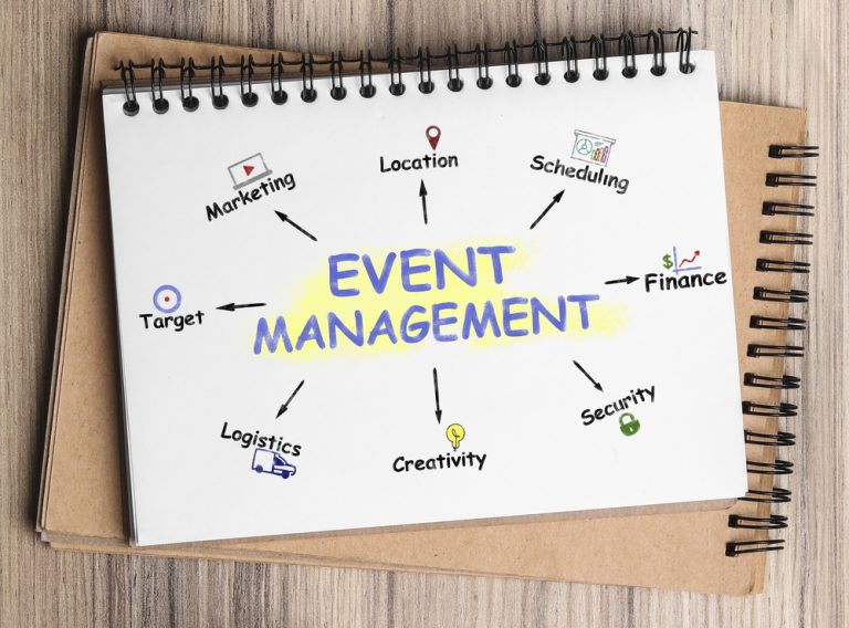
Why Your Event Registration Form Template Matters
A bad event registration form template can kill excitement before your event even starts. Here’s why a smooth event registration form makes all the difference:
More Sign-Ups, Less Drop-Offs – The easier your online event registration is, the more people will actually complete it. If it’s too long or confusing, expect drop-offs.
Keeps Attendees Excited – A short and simple form keeps momentum going. Nobody wants to lose enthusiasm just because they’re stuck on a tedious sign-up page.
Better Data (Without the Overload) – Sure, you need attendee details, but do you really need their job title, company revenue, and favorite pizza topping? Ask only what’s needed—save the rest for later.
Professional Yet Friendly – A well-structured conference registration form template looks polished but doesn’t feel robotic. Clear instructions, a friendly tone, and an easy layout go a long way.
Key Factors to Consider When Choosing an Event Registration Form Template
Simplicity & Ease of Use
A long or complicated event registration form template is a surefire way to lose potential attendees.
- Keep it short and sweet—only ask for what’s necessary. Name, email, and maybe one or two extra details.
- Use clear labels and instructions—attendees shouldn’t have to guess what you’re asking.
- Test it! Ask someone unfamiliar with your event to go through the online event registration process and see where they hesitate.
Customization Options
Your event is unique—your event registration form should be too.
- Branding matters—logo, colors, and fonts should match your event’s vibe. No one likes a generic form that looks like it was thrown together in five minutes.
- Custom fields—want to know their meal preference or t-shirt size? Add it (but only if it makes sense).
- Conditional logic—make forms dynamic! If someone selects “VIP Ticket,” show extra questions. If not, keep it simple. No need to overwhelm everyone with unnecessary fields.
Mobile-Friendly & Responsive Design
Let’s face it—most people will fill out your conference registration form template from their phone.
- Test it on all devices—what looks great on a desktop might be a mess on mobile.
- Avoid tiny text and endless scrolling—attendees should be able to register in a few taps.
- Auto-fill features—make it easy for users to enter their details quickly.
Integrations with Other Tools
A great event registration form should do more than just collect names. It should work with your other event tools.
- Sync with CRM & email marketing—automate follow-ups and confirmations.
- Connect with payment gateways—for paid events, make checkout seamless. No one wants to jump through hoops to pay.
- Automate attendee lists—save time by letting your system do the work.
Security & Data Privacy
People want to know that their info is safe.
- Use encryption—protect personal details from hackers.
- Follow GDPR and data protection laws—especially if you’re dealing with international attendees.
- Secure payment processing—attendees should feel confident entering their card details.
Must-Have Features in an Event Registration Form
One-Click Social Media Sign-Ups
Nobody likes filling out forms from scratch. Give attendees the option to sign up using Google, LinkedIn, or Facebook with just one click. It saves time and avoids typos (because let’s be honest, no one enjoys typing out their email five times just to get it right).
Automated Confirmation Emails & Reminders
Ever signed up for something and then totally forgot about it? Exactly. Automated confirmation emails reassure attendees that their registration went through, and reminders (sent a day or an hour before the event) make sure they actually show up. Bonus tip: Include a calendar invite so they can add it with one tap.
Multi-Tier Ticketing Options
Not all attendees are the same. Some want the VIP experience; others just want access to the basics. Your registration form template should support different ticket types—free, paid, VIP, early bird, etc. This way, people can choose what works for them without getting confused.
Time-Zone Adjustments for Global Attendees
If your event is virtual, you need this. Nothing is more frustrating than realizing you’ve missed an event because the time was listed in EST and you’re in Australia. An event registration form that automatically adjusts time zones based on the attendee’s location means fewer missed events and happier attendees.
Multi-Language Support
Hosting an international event? Not everyone speaks English fluently. A form that offers multiple language options makes it more inclusive and increases sign-ups from different parts of the world.
Promo Code or Discount Field
Marketing 101: Everyone loves a good deal. Whether it’s an early bird special, a group discount, or a loyalty perk, adding a promo code field to your event registration form encourages sign-ups and rewards your audience.
Common Mistakes to Avoid
Picking the wrong registration form template for your event can cause more headaches than it’s worth. Here’s what NOT to do when setting up your online event registration.
Making the Form Too Long and Complicated
If signing up feels like homework, people won’t do it.
- Keep it short—name, email, and a couple of key details should do the trick.
- Use dropdowns and checkboxes to make answering faster.
- If you must collect extra info (like meal preferences or T-shirt size), consider breaking it into sections.
Not Testing the Form Before Launching
Imagine this: You’ve set up a flawless event registration form, shared the link everywhere… and then someone tells you the “Submit” button doesn’t work. Ouch.
- Test it on different devices (laptop, phone, tablet).
- Try signing up yourself—was it easy, or did it make you want to scream?
- Get a few friends or colleagues to register and see if they run into issues.
A simple test run can save you from last-minute disasters.
Choosing a Template That Doesn’t Match Your Event Type
A conference registration form template shouldn’t look like a party invite, and a webinar sign-up form shouldn’t feel like a job application. The layout, fields, and design should fit your event.
- Hosting a casual networking event? Keep it simple and friendly.
- Running a professional conference? Include fields for company name, job title, and industry.
- Selling tickets? Make sure there’s a smooth payment integration.
Ignoring Accessibility
Not everyone registering will have perfect vision or a mouse to click through. If the registration form template of your event isn’t accessible, you’re unintentionally shutting people out.
- Use clear, readable fonts with good contrast.
- Make sure the form works with screen readers.
- Allow for keyboard navigation (some users can’t use a mouse).
Step-by-Step Guide to Customizing Your Event Registration Form
Step 1: Keep It Simple
Stick to the essentials—name, email, and any must-have details. If you don’t absolutely need a field, ditch it. The shorter the form, the higher the chances people complete it.
Step 2: Add Your Branding
Make the event registration form template feel like part of your event. Add your logo, use your brand colors, and write a friendly welcome message. A well-branded form builds trust and makes your event look polished.
Step 3: Test Different Versions (A/B Testing)
Not sure what works best? Create two versions of your form with small tweaks—like different button text (“Register Now” vs “Sign Me Up”) or a shorter vs. slightly longer form. See which one gets better sign-up rates.
Step 4: Check Mobile Friendliness
Most people sign up from their phones. Open your form on different devices—if it’s hard to read or forces people to pinch and zoom, it’s time for a redesign. A mobile-friendly form means fewer drop-offs.
Final Thoughts – Keep It Easy, Keep It Fun
At the end of the day, your event registration form shouldn’t feel like a chore. Keep it short, make it look good, and test it before you send it out. If people can sign up in under a minute without getting frustrated, you’ve nailed it.
A smooth sign-up process is just the beginning! With Grupio, you can manage your entire event from one place—agendas, updates, and attendee engagement, all in a mobile event app.
Get started with Grupio today and create a hassle-free event experience!

Zeena Awan is a dynamic Senior Project Manager at Grupio, recognized for her proven ability to lead complex, large-scale projects from inception to successful delivery. With extensive experience in project planning, execution, and process optimization, she excels at streamlining workflows, aligning cross-functional teams, and driving efficiency across operations.
Zeena is highly regarded for her strategic problem-solving skills, strong leadership, and commitment to excellence, consistently ensuring projects are delivered on time and to the highest standards of quality. At Grupio, she plays a pivotal role in enhancing operational processes, fostering collaboration, and implementing scalable solutions that align team performance with organizational goals. Her focus on both client satisfaction and team success has positioned her as a trusted leader in ensuring seamless project outcomes.